Search work, creatives, or categories...

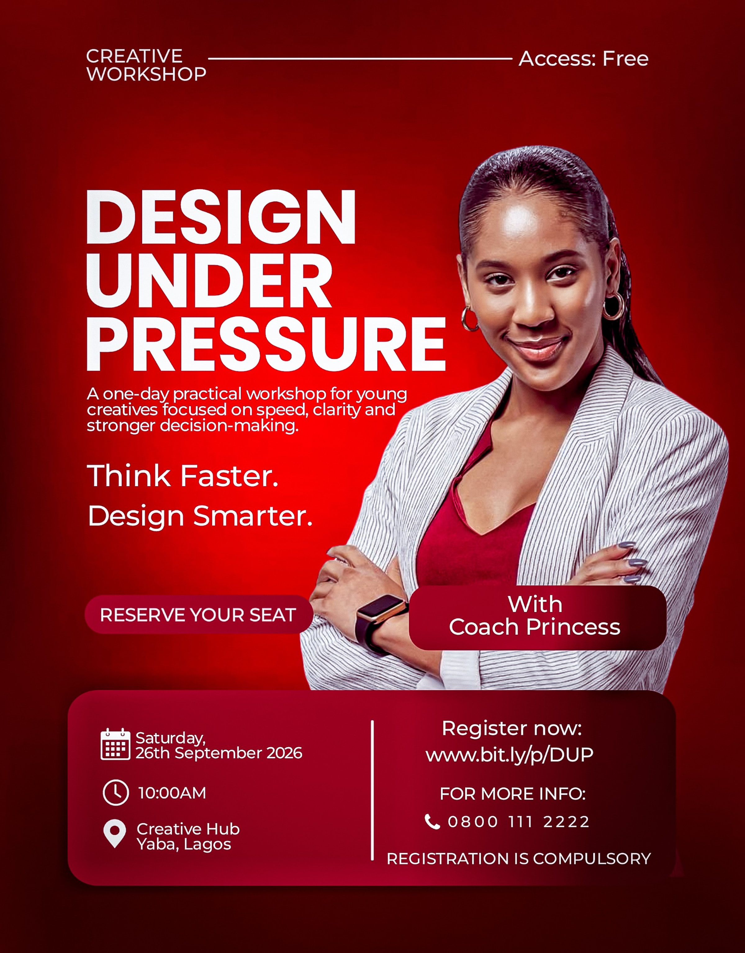
I wanted the flyer to visually communicate pressure through controlled tension using a restricted two colour system, oversized typography and a single focused photograph. The typography carries the urgency and energy of the workshop, while the structured information block keeps the essential details clear and easy to scan.

Create a profile to submit a critique, join the conversation, and contribute to the overall score.